by Zipbooks Admin
6 Business Card Design Best Practices (With Inspiration & Examples)
Regardless of how well a business card design may look, there are fundamental best practices to follow when it comes to design, color, and layout. After all, your business card needs to serve its purpose as one of your most personal and versatile marketing/branding/call-to-action tools that you have.
For example, things like logo placement and card stock—while they may seem trivial at first—can make all the difference when it comes to standing out in a stack. Remember the iconic scene in American Psycho where the lead character obsesses over one of his colleague’s business cards?
 Don’t get so obsessed over creating the best business card in the history of the world that it keeps you up at night, but you should definitely care about your card being balanced, focused, and targeted to your ideal user—so they actually get in touch with you.
In this article, we will cover the top business card design best practices you need to consider when it comes to creating an awesome business card, as well as how to keep it on-brand and ensure it’s memorable enough that your prospect sticks it to their fridge or office whiteboard.
1. Establish your logo design and colors
It may seem obvious, but if you want your business and brand to be taken seriously, then it is best practice to invest in a professional logo design along with a set of brand guidelines—also known as a style guide.

Image via Looka
Let’s start with your logo
There are many ways you can get a custom logo designed. And the cost of your logo will vary. On the more affordable end of the spectrum, you have options like using an online logo maker, using a website like Fiverr, or buying a logo template and customizing it yourself in a program like Adobe Illustrator or Canva. With these logo options, you’re looking at a price range of $20-$200.
What about colors?
Be sure to get the exact colors and fonts used in your logo design, so the same elements can be used on your business cards—creating a consistent experience. Not every color is the same, and it may end up that your brand colors will impact things like:
- Which card stock you can use—If your brand colors are more monochrome, then using a thinner card stock is an option. If your colors are vibrant, your card stock will need to be thicker.
- Your cost to print—Not all colors are equal and several colors may need to be mixed to create your particular shade of blue.
This is why it makes sense during the logo design stage to have a set of brand guidelines created, especially if you’ll be working with printing companies for flyers, mailers, and events. Your partners and vendors will love you.
2. Don’t skimp on your card stock or material
Card stock and or material is another area where many small business owners are thinking outside the box, investing a little extra coin, and creating a card that’s worth hanging onto purely because of its uniqueness and perceived value.

Image via Julie Antinucci
I once received a business “card” from a custom t-shirt printer that was printed on a rectangle of cotton fabric. Not the most solid material, but I still remember it (and have the card) years later. Other types of unique materials for business cards include:
- Wood
- Cork
- Leather
- Metal
- Cotton paper
- Chocolate
What is business card stock?
Card stock (also written as cardstock) is a paper stock that is thicker than traditional printing paper. Usually, most business cards are printed on card stock that is 350 g, 45 kg, or 12 pt (thickness). It’s best practice to print your business cards on a thicker stock for a few reasons:
- The thicker the stock, the better your business card design will hold up over time. Whether you carry business cards in your wallet, purse, or glove compartment, we all know what happens to thin cards – they eventually get ruined.
- Believe it or not, how your business card “feels” speaks a lot to the quality and professionalism of your company. In terms of first impressions, handing someone a durable business card vs something that feels flimsy can make all the difference. It’s similar to having (or receiving) a good handshake.
- If you plan to have printing on both sides of your card, a thicker stock is the only way to go. Printing on both sides requires the card to hold more ink. Using a thicker stock ensures your design remains intact.
3. Pick a font pairing that best represents your brand
Picking the right font for your business card takes a bit of strategy, a dash of creativity, and a healthy dose of intuition. Often one of the most overlooked elements of business card design, the fonts you choose can have a direct impact on the perception of your brand. Good typography tells a story of its own.
Image via Shutterstock
When it comes to picking the right fonts for your business card design, you must consider the hierarchy of the content, the weight of your fonts, and how much text you want (vs need) to have on your card. Here are a few tips to ensure your font choices hit the mark:
- Stick with font pairings of 2 or 3 fonts—Too many can be confusing. Fontpair.co is a great resource for choosing proven font pairings.
- The best business card fonts should challenge the norm, but not too much—Steer clear of Comic Sans, but still make sure your fonts are readable and clear.
- Don’t be afraid to showcase your personality—whether you’re a company or a personal brand. If there’s one way to make your card fun, it’s with font.
- Consider using print-friendly fonts and font sizes—If your plan is to have a mini square business card, be sure to choose a nice clean font that is big enough to read with minimal effort or squinting.
Font type can also invoke a sense of style. Helvetica or Futura could give off a sense of elegance, whereas a font like Mohave would be great for a strong headline that’s directly engaging and commands attention.
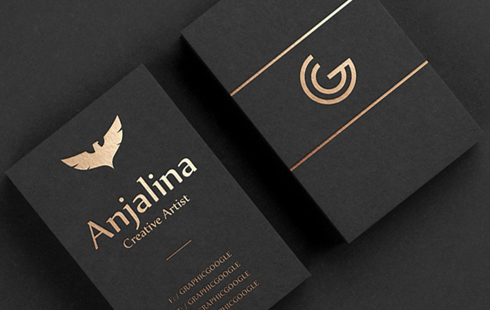
4. Logo placement matters
Determining the best placement of your logo on your business card can be quite a challenge for designers. This is another scenario where having a brand style guide comes in handy. Is your brand subtle and subdued? Or is your brand in-your-face and extroverted?
The worst thing you can do is stick your logo in the top corner and call it a day. That could very well be what works best for your brand, just be sure to get creative, move things around, and see how different logo placement or arrangement makes you feel.

Image via Looka
Keep in mind, your logo may have several elements like a wordmark, symbol, or monogram. In the example above, you can see on one side of the business card the background is blue with the combination mark (logo and symbol) centered. On the opposite side, you can see just the symbol again in the bottom left corner.

Image via Design Inspiration
If you’re going with a vertical business card layout, try using a large logo in the top or bottom half of the card. This is a great way to portray confidence and attitude if that’s your thing.
Another great way to be “brand first” with your business card design would be to make your logo larger than the actual card on one side, acting as the background. This can be extremely effective, especially if your logo has two colors with enough contrast.
5. Consider brand identity with card shape and size
Once you have your logo and colors defined, it’s time to think about the shape and size of your cards. Think about it: from a design standpoint, the card is your canvas. And this is definitely an area where business owners can truly stand out and speak directly to their industry and target market.

Image via How Design
Chomp, a design agency in the UK, took their business card design to the next level and directly played off their company name (which is also carried throughout their website design).
What is the standard size of a business card?
The dimensions of most standard printed business cards is 3.5 x 2 inches, and it is best practice to include a “bleed” area. The bleed refers to an 1/8th inch space around the outside of the card. Having bleed allows things like background color to go right to the edge of the card instead of having a noticeable border. When choosing the size of your business card, keep shape in mind as well.
What shape can my business card be?
You will find most credible online printers have a variety of business card shapes available. These typically include:
- Rounded corners
- Vertical
- Square
- Mini
- Folded
Whatever shape you choose, keep in mind that the more custom you go, your cost is likely to increase. And if you’re asking yourself “is this shape too tacky?”, it probably is.
As far as best practice goes, we recommend keeping your card simple to start. Let your design and content speak for themselves, and if it’s clearly obvious that your brand needs a card shape beyond the traditional rectangle (like Chomp), then make sure you spend the money to hire a designer and do it right.
6. To finish or not to finish?
One of the biggest ways you can enhance your business card design is choosing the right type of finish. When your design, card stock, and finish are all in sync, the end result is a lasting first impression that just “feels” right.

Image via Ricky Carmichael
What is business card finishing?
When it comes to paper, the word finish simply refers to a final coating or treatment to finalize the design. In terms of business cards, the type of finish that’s available to you can depend on the card stock or material you’re printing on, as well as the capabilities of the printing service you’re using.
The most common business card finishes are:
- Matte is one of the most popular and timeless finishes. Smooth to the touch and very professional.
- Spot UV is a treatment that involves applying varnish to a specific element on your card, such as your logo. Like the image above which is matte finish with spot UV treatment on the logo.
- Emboss and deboss can bring dimension to your cards, making elements either pop out or drop in.
- Gold or silver foil finishing involves adding a metallic finish to elements of your business card, allowing them to catch the light and truly shine.
Should I only use one finish for my business card?
Actually, it’s becoming best practice to combine finishes for a truly custom business card creation. For example, combining a matte finish with foil stamping and deboss can produce a result like what you see below.
Image via Digitized Visions
Much like with the colors you choose, the type of finish and number of treatments you choose can affect your cost. There’s nothing wrong with opting out of any special business card finish, and even going with no finish at all—as long as it’s aligned with your brand and gives an accurate impression to your potential clients.
Maybe you’re in the recycling business. Which in that case it would make total sense to use recycled paper stock with no finish at all—raw and uncut.
What about digital business cards?
Ok, I know what you’re thinking, “If I have a website or Facebook account, why would I need a digital business card?” The truth is, you don’t need one. Especially if you have an awesome business card design on lovely stock with a super professional finish.
But you should still get one, and here are a few reasons why:
- Digital business cards are often free or low cost to create, with nothing more than a simple mobile app like CamCard or Inigo
- These apps will design, store, and send your digital business card to another person’s mobile device with ease. Which is awesome, especially if you’ve forgotten your cards.
- With mobile phones often being at the center of most people’s personal and professional lives, giving someone the ability to save your info quickly is key.
If your company is within the technology or digital sector, beaming someone your digital business card can be a great way to make a first impression. It’s an easy way to let prospective clients know you are ahead of the trends.


")


")