by Zipbooks Admin
Introducing Color Accessibility Mode for ZipBooks Transactions
1 in 12 men and 1 in 200 women worldwide are affected by color blindness, also known as color vision deficiency (CVD).
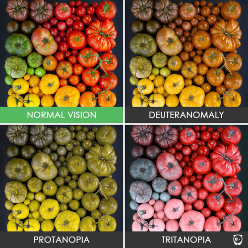
The most common types of CVD are red and green weak forms, (deuter and proton). The key issue for red-green colorblindness is that hues that most people can clearly distinguish, look very similar. Check it out:

With the exception of tritanopia—which only affects about .008% of the population—red and green are the most difficult colors to distinguish, especially when they are next to each other!
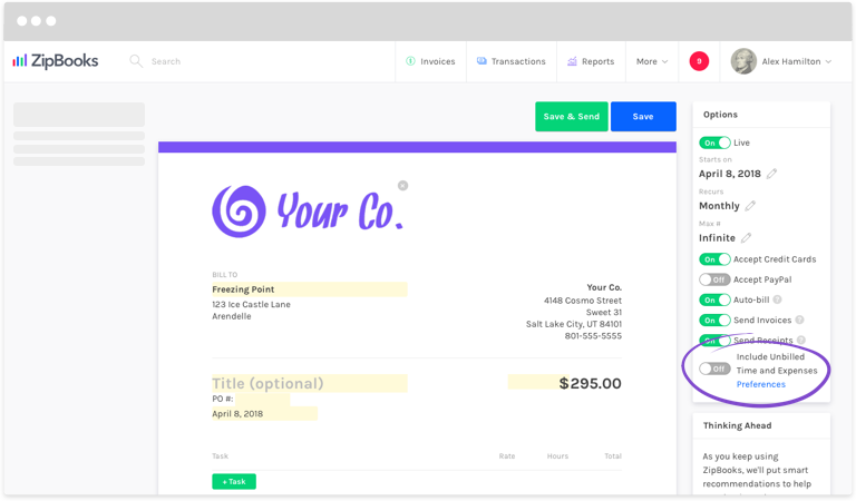
In financial reports, red and green are commonly used to show negative and positive numbers (respectively). At ZipBooks, we color code your transactions to make it even easier to interpret your accounting records—particularly when money is coming in or going out.
Per usual, our default color scheme highlights your transactions in red and green. But now, we are proud to offer “Color Accessibility Mode” which changes default colors to blue and orange.
We based our new color scheme on a colorblind-friendly palette. Even for those affected by CVD, blue generally stays blue.

Our goal is to build simple accounting software that makes you even smarter. With ZipBooks’ new Color Accessibility Mode, we’re empowering you to run a better business—no matter what colors you see on a screen.
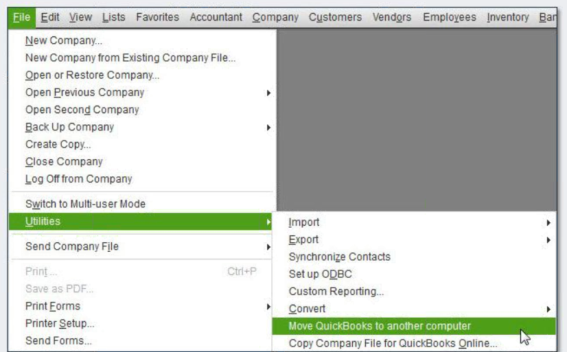
Visit our Knowledge Base to learn how to Turn On Color Accessibility Mode in ZipBooks.
Think you might be color blind? Take a quick test to find out!


