by Zipbooks Admin
How to Make Your Own Accounting Logo
Have you heard the joke about the interesting accountant? No? Me either.
(As a company full of accountants, we’re allowed to make that joke).
Accounting may be notoriously boring, but that doesn’t mean your logo has to be. You might have an idea in mind, might be looking to rebrand, or might be starting from scratch. We’re going to share some useful tips to creating an accounting logo that your clients will remember.
Accounting Logos from the Big Four
The main goal of accounting logo design is to evoke a sense of reliability and security from its target audience. Many successful companies are trying to introduce both geometric and defined details in their logos.
Check out the logos from the Big Four to get some accounting logo ideas:
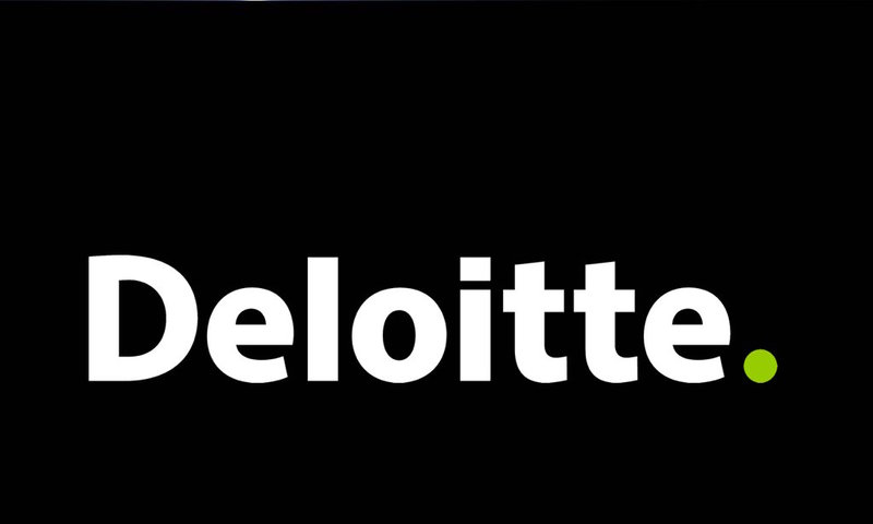
The Deloitte logo is pretty simple. The designer only used the company name to create the text logo. The font they use is big and heavy-weighted, which creates an impression of solidity. The small, bright green dot at the end of the text was created back in 2003, giving the logo a modern update.
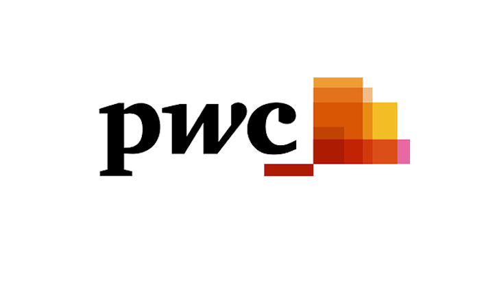
PwC decided to take an innovative approach. They preferred the bright, warm colors to standard cool shades; the warmth suggesting friendliness. Also, they chose to use serif fonts since they did’t need to worry about the readability and scalability of the three-letter text.
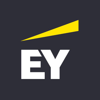
Ernst & Young (EY) uses the abbreviation of its company name in bold, white letters. The logo is minimalistic, but at the same time strong and loud. An interesting signature detail is the bright yellow triangle depicting the light projected from a lantern illuminating the road. This is a great example of how simple geometric symbols can convey a powerful message.
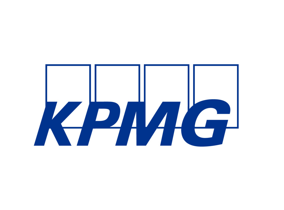
The name KPMG is an abbreviation, representing the four founders: Klynveld, Peat, Main, and Goerdeler. The company’s logo is designed in a strictly traditional style. Cool blue shades dominate, with a large font and rectangular shapes. Such a classic financial logo perfectly speaks to the company’s experience and trustworthiness.
Each of these logos has benefitted the overall vision and brand of its accounting firm. Here are some of the key takeaways that can help you build your accounting logo:
1. Color can be endearing
According to color theory, colors can affect a person psychologically, causing special feelings and associations. Colors can even change our moods and evoke desires. Therefore, before painting the logo in your favorite color, make sure that it triggers the necessary emotions to properly present your company.
For accounting firms, popular colors are green and gold which creates associations with money while black, purple and red symbolize luxury.
Nevertheless, the most used color by successful companies is blue—think Facebook, Twitter, HP, Walmart—it’s a global favorite.
Blue is calming and creates a sense of trust. Multiple bright colors are less common in accounting logo design because they are often used to demonstrate a non-standard approach in business.
2. Font is more than words
Minimalism is trending in design. Keep the logo to its simplest form, sometimes just the company name will do. Logos usually include text in their design with or without icons. When choosing the font, it is important to choose according to the mood you plan to convey.
If the priority of your brand is to focus on its experience and commitment to traditions, then use big and bold fonts. If you are aiming to build customer loyalty, then choose softer and smoother fonts.
It is important to maintain the aesthetic by balancing the icon, color and shape of the logo. Also, try to maintain the readability of the text with scalability in mind and stay away from using complex fonts with serifs.
3. Let icons tell the story
Monetary symbols are quite common in financial logos. In order to stand out among competitors, you need something not as predictable.
Conservative emblems are great choices. The imagery of a lion, bull or horse can create the impression of wealth and strength. Monograms have the same effect.
Geometry is quite popular among accounting logos, too. Simple and defined geometric shapes are the best ways to convey honesty and transparency. If your company name is not something abstract and quite realistic to portray, then take this opportunity to create an icon that will help customers remember your brand. You could even find an icon online using a service like icons8 or iconfinder.
What about a slogan: is it necessary?
A slogan is a short message representing your company. This message can inspire association, evoke emotion, assure quality and provoke call-to-action. In a nutshell, a slogan that speaks to your audience can influence them to choose your brand over competitors. Therefore, global brands often bet on their slogans and usually win.
To create a slogan that will increase your sales, you need to first determine the competitive advantages of your brand and incorporate the essence to your logo and slogan design.
Use an online logo maker
Designing a logo for your business can be costly and time-consuming, but not with these quick solutions.
Here are some great online logo makers that allow you to try out your design (sometimes for free):
Logaster
Logaster is an online brand identity builder that has helped millions of small businesses with a fast, simple and affordable branding solution.
Pricing: Free download of a small logo and favicon icon. Paid plans start at $9.99 for more color and layout variations, different file formats, templates and social media kit, etc.
Hatchful
Hatchful is Shopify’s free logo creator. Hatchful uses online with stock imagery and creative templates to generate simple logos. Creating a logo does not take much time, but the icons used may not be unique.
Pricing: Fully free
Ucraft
Ucraft’s free logo maker offers an empty canvas and many shapes and tools, which allows you to fully express your imagination. The result predominantly depends on your skills. So if you have a good sense of style and time, you might be able to create a great logo.
Pricing: Free download of logo in PNG; SVG starts at $12.
A professional logo can help your financial business
An effective logo will differentiate your company from competitors. Creating a unique brand image will attract the attention of your target audience. But in order to maximize its effect, aestheticity is not the only important factor.
The active promotion of your logo across various marketing collaterals that will enhance your brand awareness.
Here’s where to apply your logo:
- Prints: business cards, letterheads, envelopes, flyers, invoices, internal documents.
- Web pages: Profile pictures on social pages and corporate site.
- Corporate products: stationery, promotional products, etc.
- Office interior: wall stickers, banners and other decorative elements.
- Digital and outdoor advertising: videos, posts and articles, billboards, signs, posters.
Remind your target audience of your logo wherever possible, so that they will instantly think of your company when in need of financial services. The more familiar they are with your brand, the more likely you will make a sale.

")


")
